
I am excited to share the prints from an ongoing collaboration between myself and Nesja Press. You can make one of them yours (click here)! There is also a link to purchase a print at the bottom of the page. But first, the story of how this came to be.
In addition to publishing cartoons in the New Yorker magazine, I have had more than my share of drawings appear in the back pages as part of the cartoon caption contest as well. Sometimes the reader entries are ten times funnier than my original captions and sometimes they are found wanting, but it is always enjoyable to see what people come up with.
Paul Nesja is a reader who entered the contest rigorously, and who also has had more than his share of appearances among the finalists. In March 2021, he and two other contest finalists launched the New Yorker Cartoon Caption Contest Podcast to discuss the weekly entries and, eventually, to interview the cartoonists themselves.

I had a string of drawings appear in the caption contest in 2021, so I was a frequent guest on the podcast. At one point while we were discussing my woodcut-like style, Paul mentioned that he and his wife Christy had a letterpress studio. It was not too long after that that the idea was floated: could we collaborate on a print together?
It made immediate sense. The Nesjas were excited to work with a cartoonist, and I was excited to work with a printmaker. Although my style originated in printmaking, I had not done an actual print in a long time. My New Yorker work has always been done on scratchboard, a direct engraving technique which is related to printmaking. Whenever I have done a cartoon which has text embedded in it - a title or a caption or some other form of lettering, like this one - I carve away the letters in the same way that I carve the rest of the image. But it has always seemed unsatisfying to me. I’ve wished that I had a set of fonts that I could stamp around the drawing instead. So this collaboration solved a longstanding desire of mine, which is to have typography be an integrated part of the image. The idea was that we’d be revisiting and reimagining some preexisting New Yorker cartoons for this medium, and creating new ones as well.
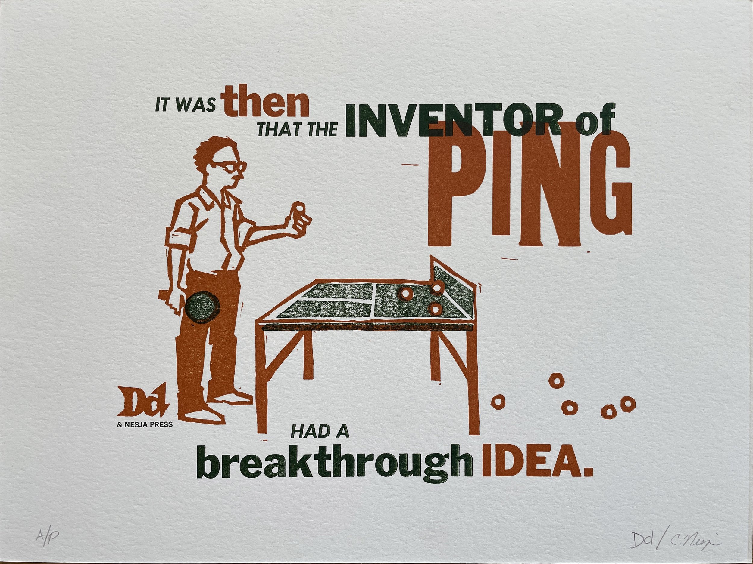
We agreed that the ‘Ping’ print would be our first offering because it was an ideal combination of text and image, and was not overly complicated to execute. I finalized a drawing, reversed it, and transferred it to a linoleum block. Then I carved out the block with linoleum carving tools and some woodcutting tools. In this kind of printing you need a different block for each color, so I needed one block for the rust color and one for the green.

One of our cats, Sumi, kept me focused and on deadline. (Sumi was named after sumi ink, used traditionally for calligraphy, so he was more than qualified for the task.)

Before shipping the actual blocks, I rolled ink over them and made some proofs, which I then scanned and emailed to the Nesjas. Christy selected the fonts from their many varieties of wood and metal type, and began experimenting with layouts and colors. Once we had agreed on a composition, it was time for the actual printing.
For a more accurate description, visit the Nesja’s account of the printing process here. The short story is that we did some additional fussing and correcting once we had test prints of the blocks, including some extra carving and the cutting of a notch in the linoleum. Once this was to our liking, the Nesjas inked the press with the rust color and ran as many sheets of paper as it took to get to one hundred quality prints. They set them out to fully dry, and then ran those same hundred through the press to add the green.


Magic! The only thing left was to number and sign the prints. One of the pleasures of block printing is the smell of the ink. It’s not a strong smell, and by the time it arrives in your mailbox there will only be traces of it, but to me it conjures up the same kind of good feelings as freshly brewed coffee or baked bread.
And, just like freshly baked loaves of bread, no two are exactly the same. That’s the beauty of letterpress and relief printing. The strength of the ink, the alignment of the colors and the way they overlap with each other - each print will have slight variations to it which make it unique.

For the second print we decided we’d revisit one of my previously published cartoons. In addition to being one of my favorites, I know that ‘Bagel Story’ has adorned the wall of multiple bagel shops, so we wanted to do a livelier, full-color version. For this print we used the same working process as with Ping, but this time with a third color, so there needed to be three separate print runs.

And so, one of these can be yours! Each print is 9’ x 12”, is numbered and signed, and comes with a separate signed certificate attesting to its authenticity. We’re asking $300 each and you can purchase them directly at the Nesja Press website. There are options for framing as well. Once they’re gone, they’re gone!